Facebook Connectivity- Meta Internship
OVERVIEW: Designed three new end-to-end reporting flows for security measures regarding monetization efforts within the Facebook app. Prototyped and shipped fully functioning models for user testing around the world. Approximately reaching over 1 billion users as 2.8 billion users purchase from FB!
POSITION:
Product Design Intern
TEAM:
Facebook Operating System
What is a data pack?
A data pack is a product developed for certain countries where users can use Facebook to purchase x amount of data or prepay for their data usage.
What does that mean?
In the United States we usually pay our phone plans every month- we may have different services or data plans but it’s usually done through our phone provider. In some countries, users have Facebook pre-downloaded on their mobile devices and are able to use Facebook to purchase data packs that align with their financial needs. Facebook also offers them the chance to stay connected or communicate even without purchasing these data packs.

Background
What is FB Connectivity?
Facebook partners with network operators to build products for people who see data affordability as a barrier for being connected online. People who opt into these markets buy prepaid data packs from Facebook’s Mobile Center to get online.
This is the in-app purchase center for data packs!
Prompt
Included in Case Study
Background
Design Problem
Research/Audit- Dogfooding
Product & User Goals
Initial Designs- Wireframing, Explorations, User Flows
Solution Breakdowns
Takeaways
Initial Start/ Research
According to our research done primarily within Pakistan and with flytrap reports, we found that at least 31.25% of users were running into errors when trying to purchase data packs. We knew that the actual number of users running into errors was most likely much larger but Facebook Operator Solutions had no way to track why the failures were happening or what kind of failures they even were.
Therefore the goal of this project was to target users that were experiencing failures with a feedback flow in both the Mobile Center and in the purchasing flows that can help us understand these issues and increase a feeling of security for our users.

Design Goal
"Errors when paying for a service on a platform can be frustrating and make users less trusting, especially when there is no solution or means to report the issue."Dogfooding: Facebook’s method of trying out products. Since I had no initial understanding of data packs or carrier services I dogfooded every possible scenario that users could run into!
Target Users: From previous UX research done in field and in reports I knew I had a wide audience to reach. Approximately 2.8 billion users seek to purchase data packs from FB!
User Research: Online reports using flytrap reporting and fail records from purchases helped me get a glance at what was going on. Please note, I can share the initial percentage of flytrap reports for Pakistan but I am unable to share any other research or data points as that is under FB.
User Goals: Curated user goals that could potentially help us get to where we needed to go!
TOOLS:
Figma, Adobe, Origami
TIMELINE:
Summer 2021 (8 Weeks)
Audit
My audit included going through every flow within the product itself as well as other areas of Facebook that had already implemented different reporting flows.
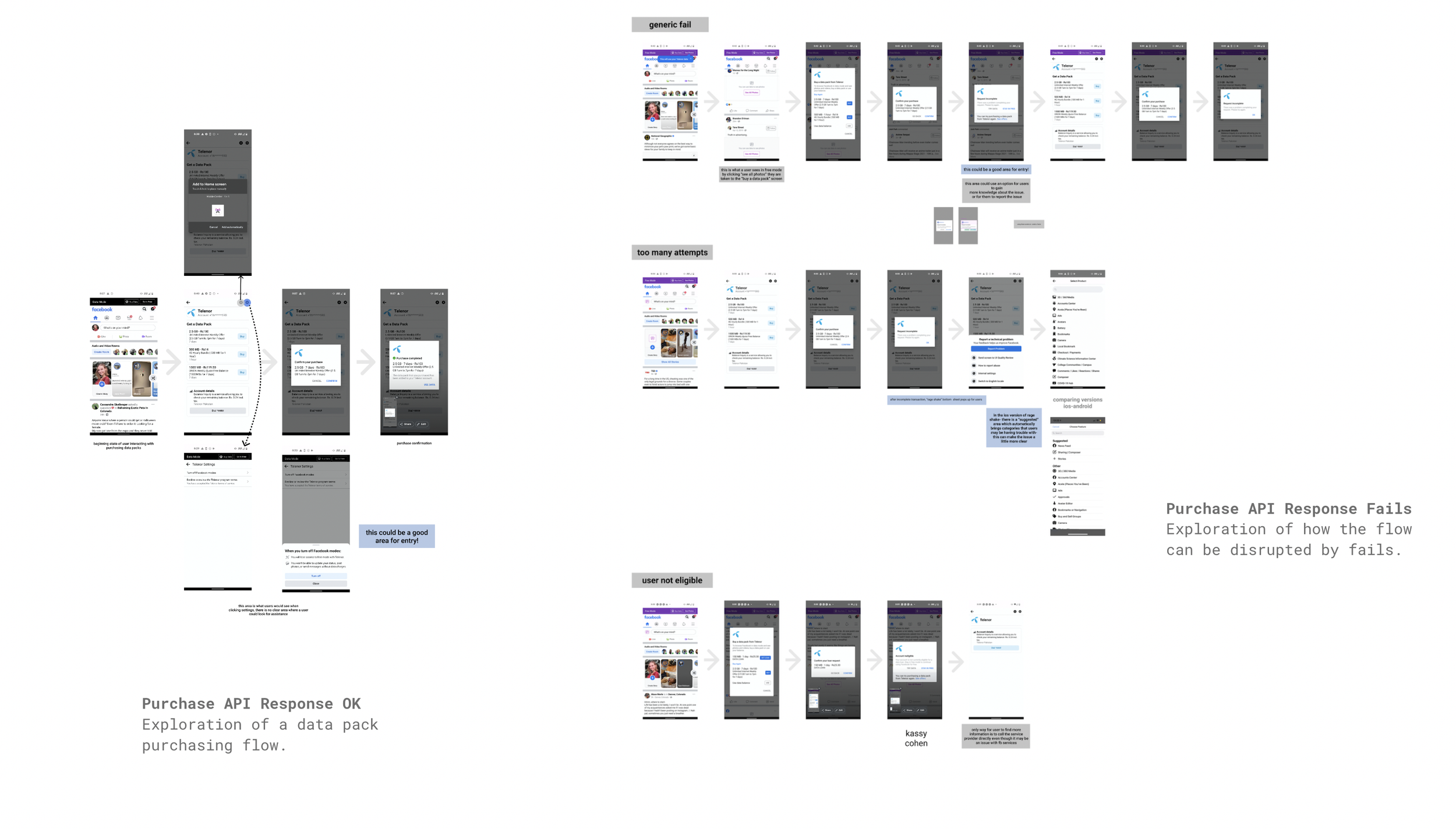
Dogfooding- How the Mobile Center Works
Here is a quick breakdown of what users experience when things go smoothly and correctly.


"This is part of my initial audit into the problem- I encapsulated the most important aspects of this research in these frames!"

Here, I am dogfooding errors specifically- every kind of error including no service, no money, no connection to carrier, user error, etc are seen here. Every error has a canned message because we do not have any information to give to users. They do not know why their purchase may have failed and we don’t either which is why creating a method of reporting will help our internal team.
Goals of Project
Product Goals: The goal of this project is to target users that are experiencing failures with a feedback flow in both the Mobile Center and the purchasing flows that can potentially be scaled for other types of issues in FOS.
User reporting flows should encapsulate full range of users experiencing errors, help Facebook remedy these issues and in the future, provide users with more context for their experience.
User Goals: The reporting flow should allow users to feel more supported than they do in the current process and be simple/accessible for all technology literacy levels.
Initial Design Explorations
After doing my initial audit into the Carrier Services and finding out these user pain points- it was then time to start sketching out various ideas. I knew I needed to hit on my project and user goals by:
Making sure the reporting area is clear and visible on home pages
Making sure the reporting area is available regardless if the flow is interrupted or not
Make sure this product is scalable
I first started with explorations and user flows to arrive at wireframes. Starting with user flows really let me see the circular issues users were encountering and how to insert various methods to remedy this.

Then after connecting with my team, and cross functional teams for design ideas- I began making my wireframes.


After my wireframing and exploration I came upon several design ideas- from entry points in the mobile center to areas where I could guide a user experiencing errors to the correct area.
Exploration 1: I began by testing out various entry points- this is where my users would be potentially looking for a report center already. I used some similar concepts from other areas of FB and also used research done by competitive audits.

Exploration 2: I then began some entry points directly in the purchasing flow- areas where users are directly putting their trust into Facebook and the Carriers with their own money. This is definitely a large pain point and a point of mistrust. Putting an entry flow in these locations would also potentially help us capture metadata on where the issue went wrong to begin with.

Exploration 3: As a stretch goal, I also began doing some wireframes and testing for what reports would look like- it is important to note that while Facebook does have reporting flows of their own, there were no current reporting options at all for these issues. Meaning, there was no reporting flow at all. We needed to make sure we caught all users and also approached their issue from their point of view. In a lot of cases, users may not read english, have low literacy rates or may have low tech literacy rates. We needed to make it simple and usable by all.

Solutions
After these explorations I got into the final solutions! These solutions were built, shipped and A/B tested in various countries for efficacy. Please note- I do not have data or numbers to showcase with solution as those are protected!
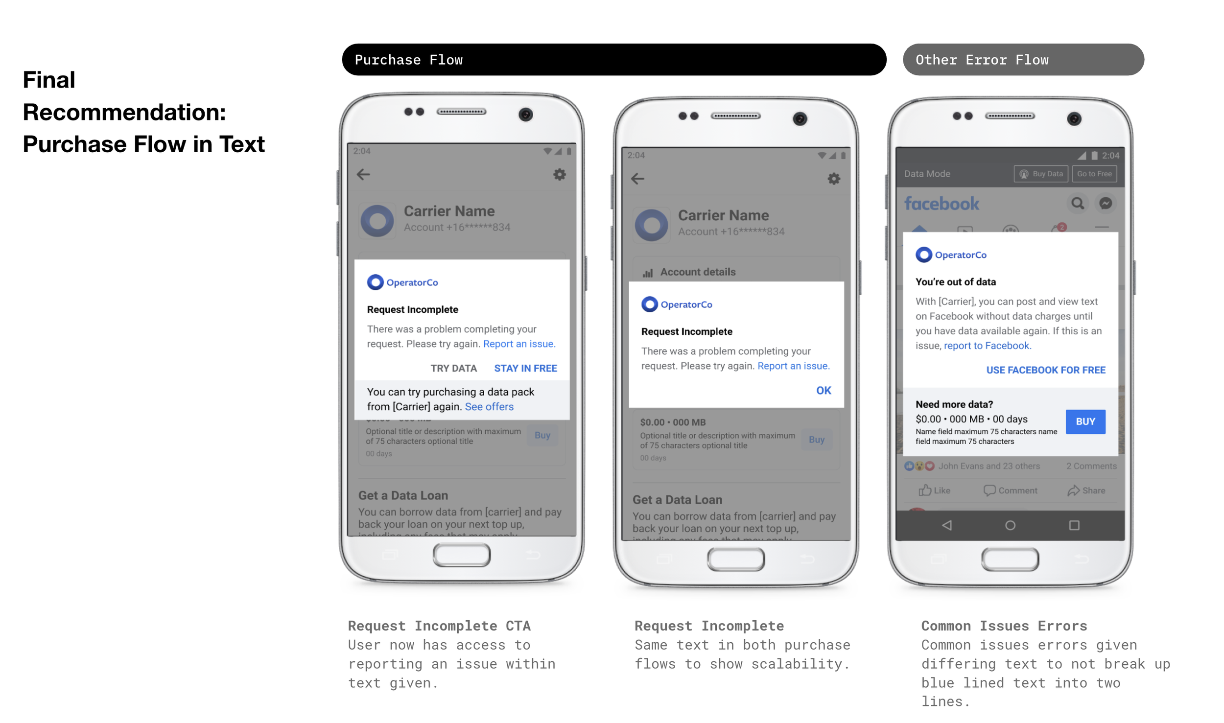
Final Solution 2: Purchase Flow in Text- This is the second final design in which a user is able to access the reporting flow within the canned error message. This helps reduce frustration when users initially encounter an error.
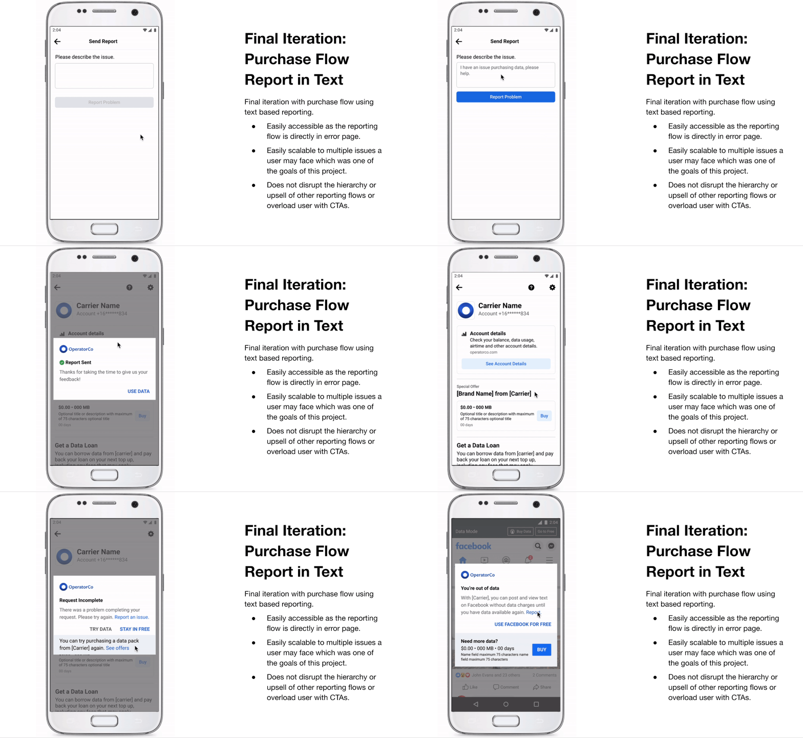
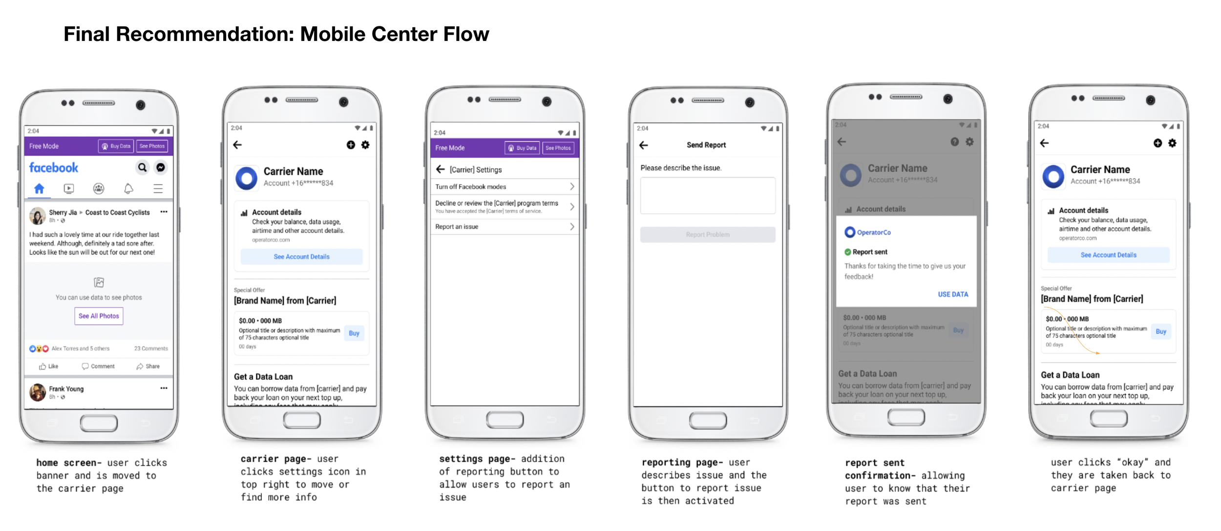
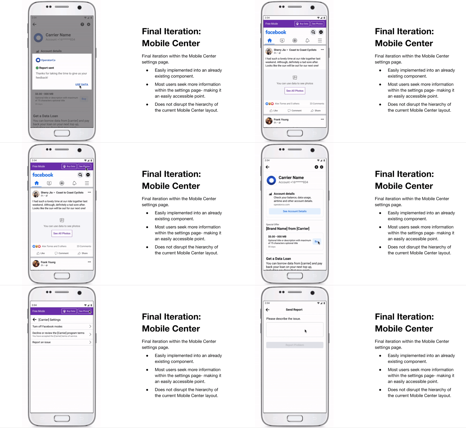
Final Solution 1: Mobile Center Flow- This is a simple entry point for users to access as it is found in a high traffic area as many people find themselves in the settings page to do basic upkeep tasks to their data. In the below picture I have outlined a simple user flow of someone finding and then sending a report.
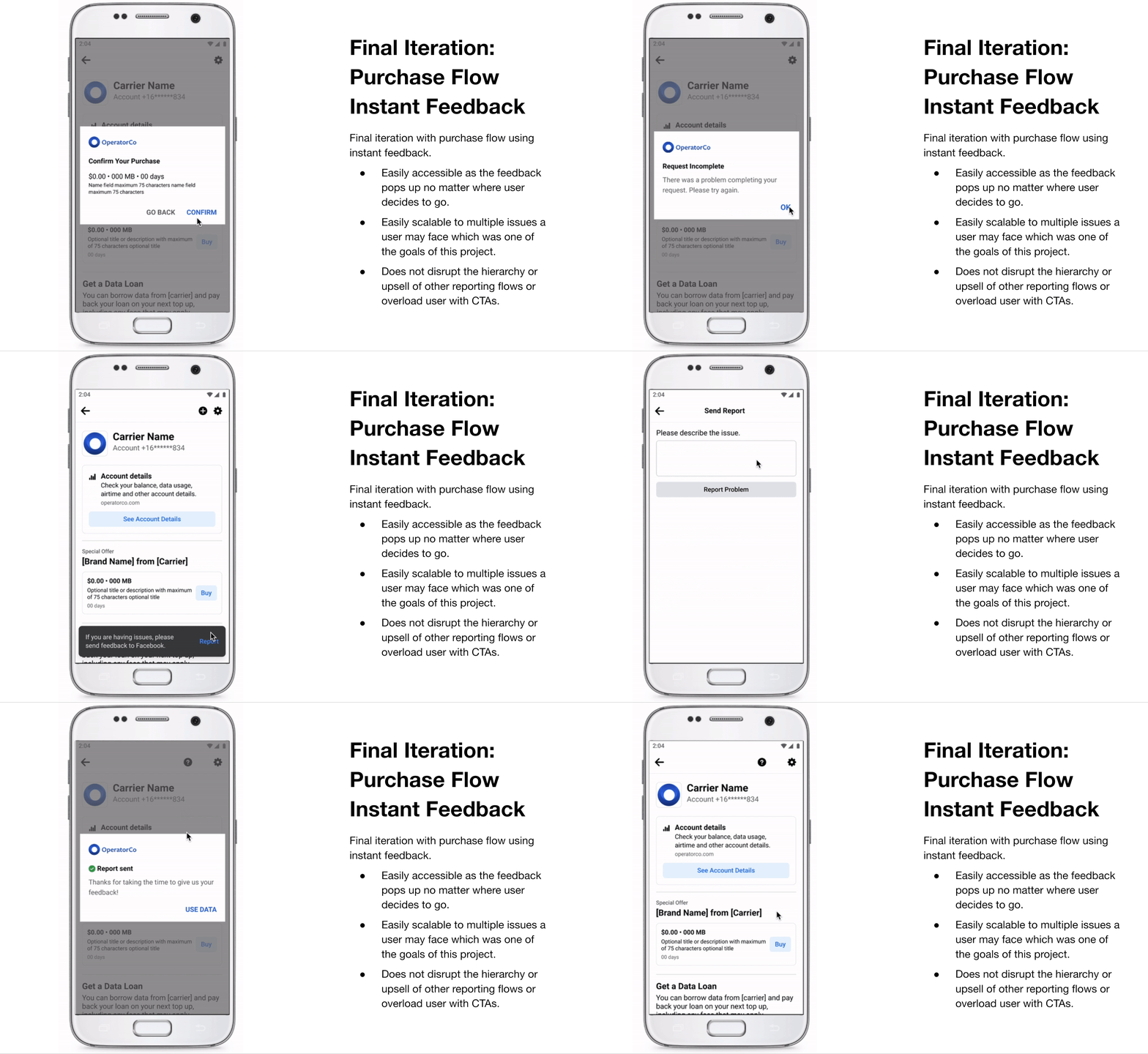
Final Solution 3: Purchase Flow Instant Feedback- This is the third final design in which a user triggers an instant feedback component when an error is seen, This method is easily accessible and does not disrupt hierarchy or information architecture which leads to upsells. However, this issue may find issues within areas that have low data or it may not trigger if a user is out of range of reliable wifi.

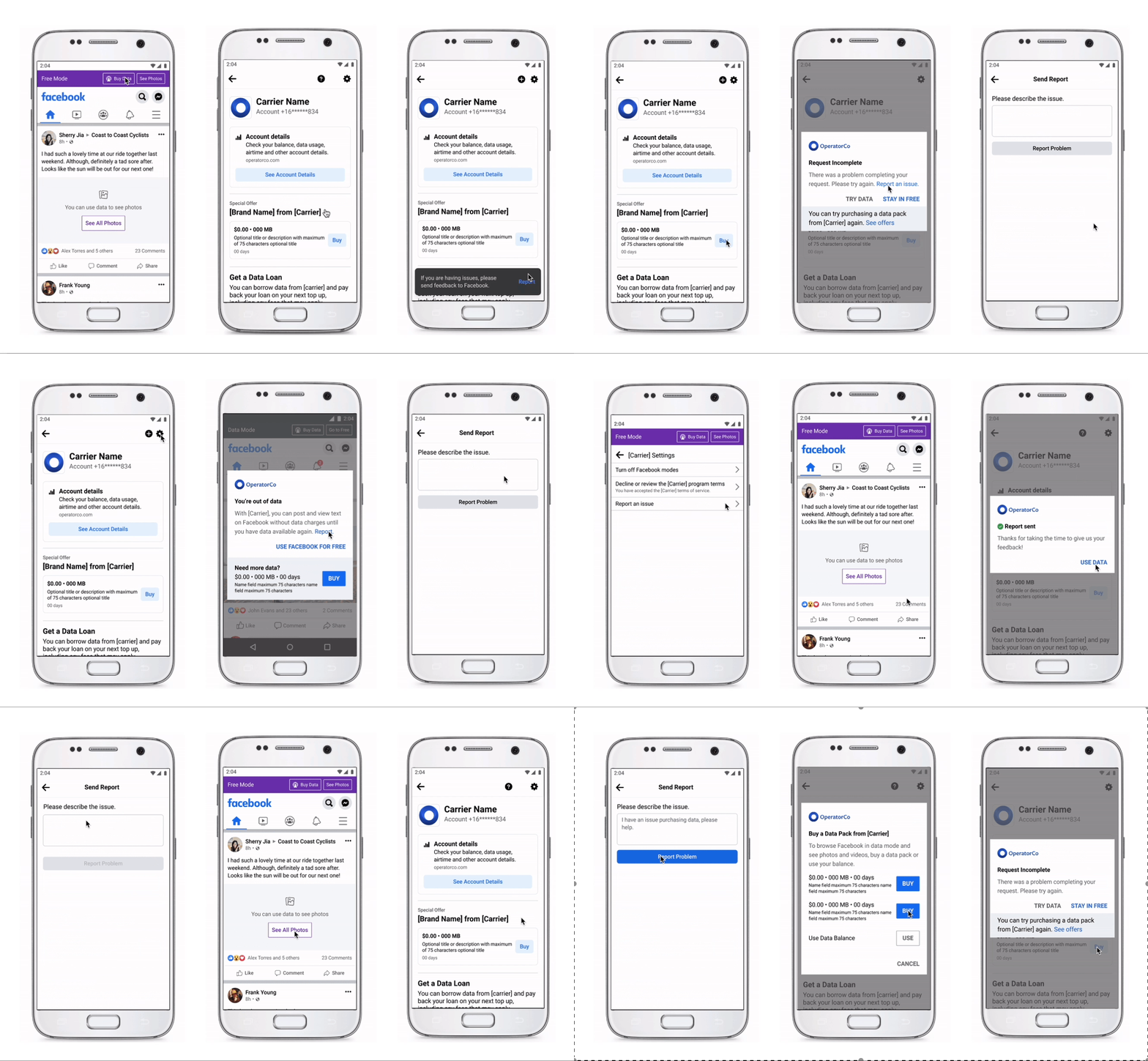
All Solutions Together
Final Solution: Several entry points and new reporting flows for users, flows will provide FB with further understanding of issues and data collection, it will build user trust and will help create solutions to frustrating errors for users.
Project Length: ~8 weeks
Programs used: Figma, Sketch, Origami
User reporting flows encapsulates the full range of users experiencing errors, it helps Facebook remedy these issues and in the future, provides users with more context for their experience
Criteria of Success
What are some criteria we were aiming for in determining success for this product?
Provides Context of Issues
User flows will provide FB with a better understanding of what issues are arising that go unreported.
Builds Users Trust
Currently, users are frustrated with their experience and this process will help them feel that their voices are being heard. Their input is also invaluable to future products we build.
Creates Solutions to Errors
Through user feedback and context of issues we will create better solutions for these common issues that users are running in to.
Impact + Takeaway
This project was my first full case project within UI/UX. I learned a lot about working within existing design systems and tailoring UI to fit different screens. In this specific case, our base model was Android phones as most of the users across the world who use Data Packs have Androids pre-installed with Facebook and use it primarily to connect with others.
I was also able to use a lot of pre-existing user data to help my design decisions and had a really robust team working on different aspects of this product that could help me every now and then. However, this project was solely rested on myself and it was thrilling to be able to take lead and initiative on this.
I learned a lot about visual and interaction design as well as product thinking while making these designs and it really is incredible to me that this product reaches 2.8 billion users around the world and now that they have a method to report errors it means that they can build further trust with Facebook.
I really enjoyed this experience and thought that it was an excellent introduction to UI/UX as I was challenged to place myself in the shoes of users I had not previously thought of using a product I had no idea existed before this summer.
I ended up presenting this project to over 600 Facebook employees and was invited back to intern again in 2022!
